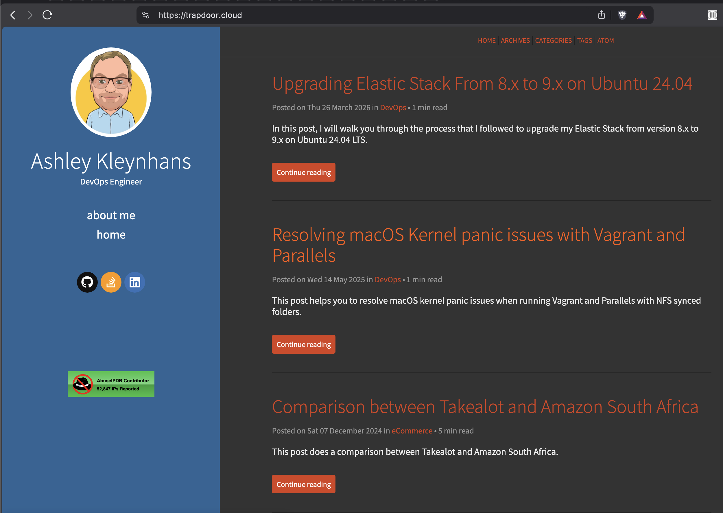
Before
After
Why I Decided to Redesign
My blog has been running on the Flex theme for Pelican for years. It worked fine, but it was looking dated. The fixed left sidebar with the blue background and orange accents wasn't exactly what I wanted anymore. I wanted something dark, modern and technical-looking, something that felt more like it belonged to a DevOps engineer.
Manually rewriting all the Jinja2 templates, LESS stylesheets and JavaScript for dark/light mode switching sounded like a miserable way to spend my time. So I let Claude Code do it instead.
Tools
I used Claude Code with the Superpowers skill. Superpowers gives you a structured workflow for complex tasks: brainstorming with a visual companion that serves mockups to your browser, a design spec, an implementation plan, and then subagent-driven development where specialized agents handle each task.
I forked the Flex theme to my own repo so I could gut-renovate it without affecting upstream.
Brainstorming
The Superpowers brainstorming skill started a local web server and served interactive mockups directly to my browser. I got visual options for:
- Layout - top navigation bar vs sidebar vs minimal header
- Visual mood - dark & technical vs clean & bright vs gradient
- Homepage - compact list vs card grid vs expanded list
- Theme mode - dark only vs dark default with light toggle
Each option was a clickable card in the browser. I picked what I liked and moved on. No back and forth trying to describe what I wanted in words.
Design
After brainstorming, Claude produced a full visual mockup of the homepage and article page. I reviewed it in the browser and gave feedback. Things like "font size is too small" and "where are the social icons?" got fixed in real-time iterations.
The design spec covered color palettes for dark and light modes, typography, code block styling, navigation, footer, and all the Pelican integrations that needed to stay working (Disqus, Google Analytics, AbuseIPDB badge, sitemap, etc).
Implementation
The plan had 14 tasks across 3 chunks:
- Config & CSS - update
pelicanconf.py, rewrite all three LESS files - Templates - new top navigation, rewrite
base.html,index.html,article.htmland all supporting templates - Build & verify - build locally and fix issues
Subagent-driven development dispatched agents for each chunk. One agent rewrote the CSS, another handled all the templates.
What Changed
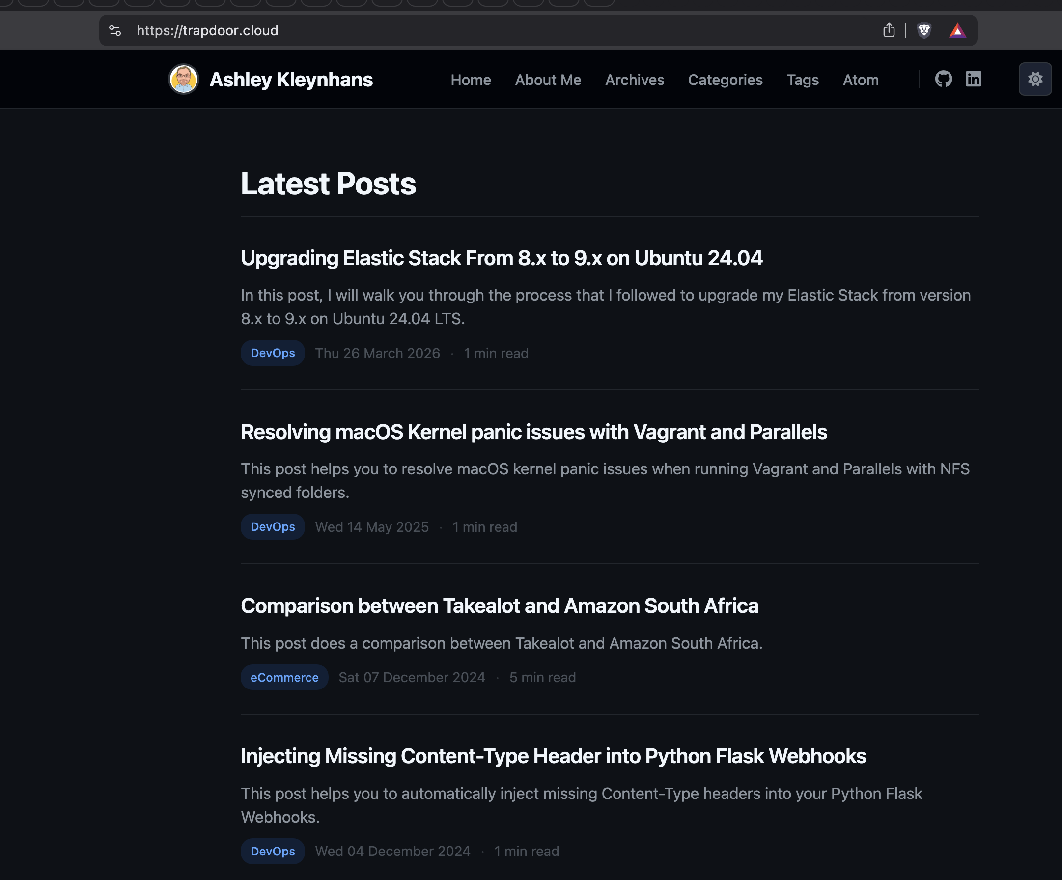
Layout - the fixed left sidebar is gone. Replaced by a slim top navigation bar with profile image, nav links, social icons and a dark/light theme toggle.
Colors - blue sidebar and orange accents replaced by a
GitHub-inspired dark palette (#0d1117 background, #58a6ff
accent blue), with a proper light mode that respects system
preferences.
Code blocks - custom syntax highlighting colors for both themes, a copy-to-clipboard button on every block, and better contrast against the page background.
Homepage - full article summaries with "Continue reading" buttons replaced by a clean list with title, summary snippet, colored category badge, date and read time.
Tags - each tag gets a unique color cycling through red, blue, purple, green, yellow, orange, teal and pink.
Other stuff - About page in the nav, card-style prev/next navigation, responsive mobile layout, less.js updated from 2.5.1 to 4.2.0.
Things That Went Wrong
It wasn't all smooth sailing.
Client-side LESS compilation broke the dark/light toggle. The old less.js version didn't handle separate stylesheet toggling properly, so we had to move all light mode overrides into the main stylesheet using LESS mixins instead.
Pygments inline styles made it impossible to have different syntax highlighting colors per theme, since the colors were baked into the HTML. Switching to CSS class-based highlighting fixed it.
The Stack Overflow SVG icon was an absolute disaster. After multiple failed attempts at getting it to render properly at small sizes, I just removed it.
Result
The whole redesign, from brainstorming to deployment, happened in a single Claude Code session. The blog went from a generic Flex theme to a custom design that actually looks good. The Superpowers skill kept things structured even when I was giving some pretty aggressive feedback along the way.